
Slate Signs & House Number Plates
Passing traffic gives a house number about two seconds. In a moving car, in fading light, the plaque is found, read and matched to the address before any conscious decision joins in. That reading constraint — not the catalogue page — is where the specification of a slate sign begins.
Natural slate signs are used for house numbers, personalised property names, garden markers, directional signage and memorial plaques. Their appeal lies in the combination of natural stone texture, customisable lettering and a substantial architectural appearance — the look of a material that belongs on a wall.
Choosing the right slate sign requires more than selecting a shape or a design. Viewing distance, slate quality, lettering method, plaque thickness, fixing details and outdoor exposure all affect readability, durability and installation. This guide explains how to specify custom slate signs for residential, landscape and commercial projects, including the practical considerations that matter to wholesale and private-label buyers.
Slate signs have a long tradition in Britain and in other regions with established slate-building practices. Wherever the material had proved itself on roofs and doorsteps, using selected small plaques as number plates and name boards was a short step; a dark hand-cut plaque with a carved or painted name remains a customary finish for cottages and period properties, and the habit has followed the material wherever the roofs went.
It sits inside the wider Jiujiang Slate Guide — alongside the printing and engraving processes that carry the lettering, and the material's broader outdoor record in paving, cladding and landscaping. If the marking methods are the layer you are choosing right now, that half of the subject has a guide of its own; this one keeps to the plaque itself and the conditions it must live in.
A natural slate sign is the right choice when you want a material that ages outdoors without pretending to stay new forever, lettering that can be cut into stone rather than stuck onto a surface, and enough physical presence to look — and be — permanent, provided the slate grade, the lettering system and the fixing method are each specified for the real exposure they will face.
Three decisions do most of the work: how far away the sign will be read from, which marking method carries its text, and how it is fixed to its wall or post. Size, font, thickness and finish all follow from those three. For garden markers, business plaques and memorials the same logic runs with different numbers attached — and this guide follows each of those cases to its own section.
Where Slate Signs Serve
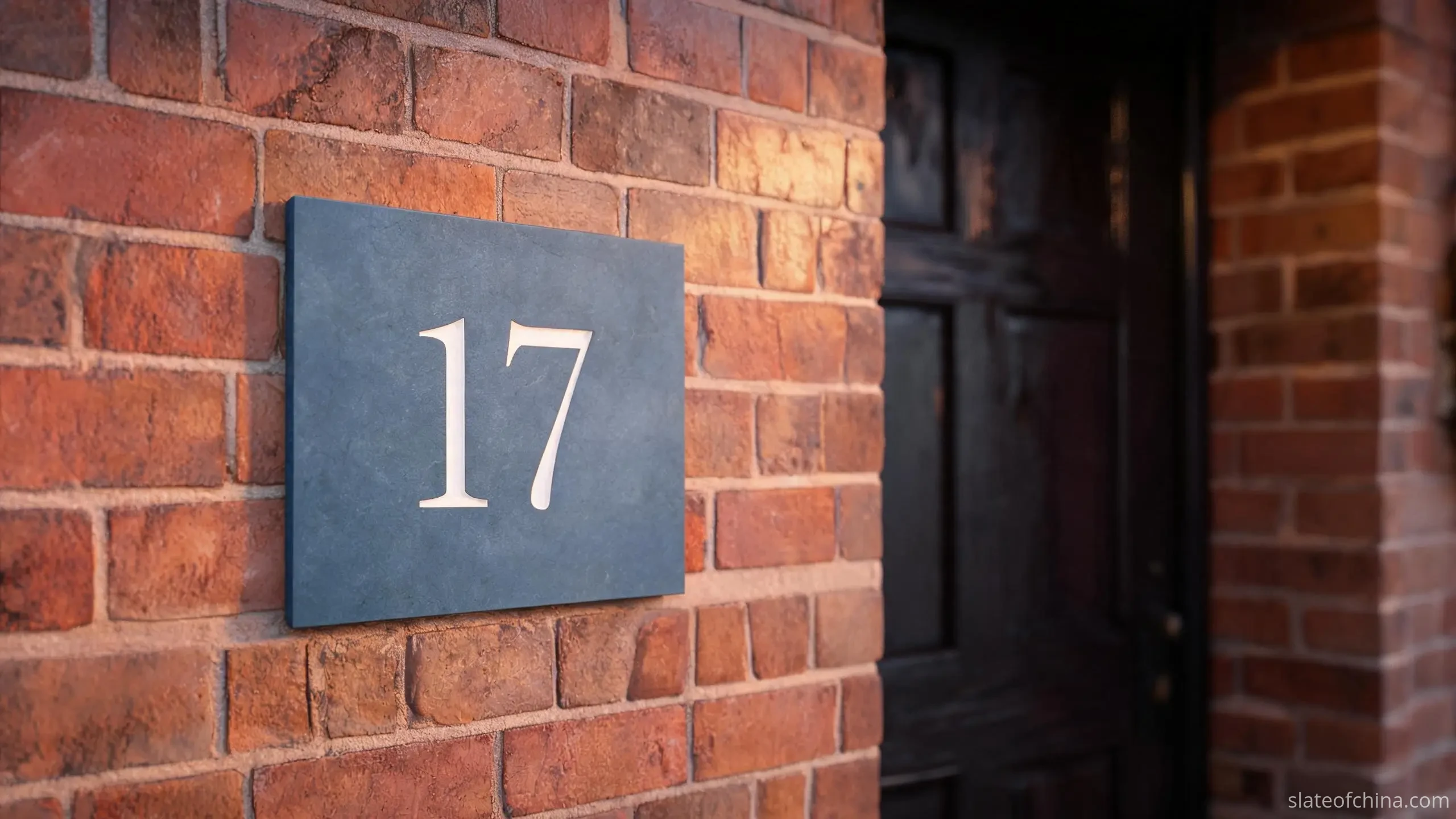
Slate signs and slate house number plates split into six working jobs, and each job is read differently. An estate agent's specification sheet starts with the application for exactly this reason — the same stone becomes a different product depending on who has to read it, from how far, and in what weather.
The house number plate is the simplest and most common item: a street number, cut or painted onto a dark plate, fixed beside the door, the gate or the garage. It is read from the road, at speed, often in poor light — contrast and numeral height dominate every other design choice, which is why this guide keeps returning to them.
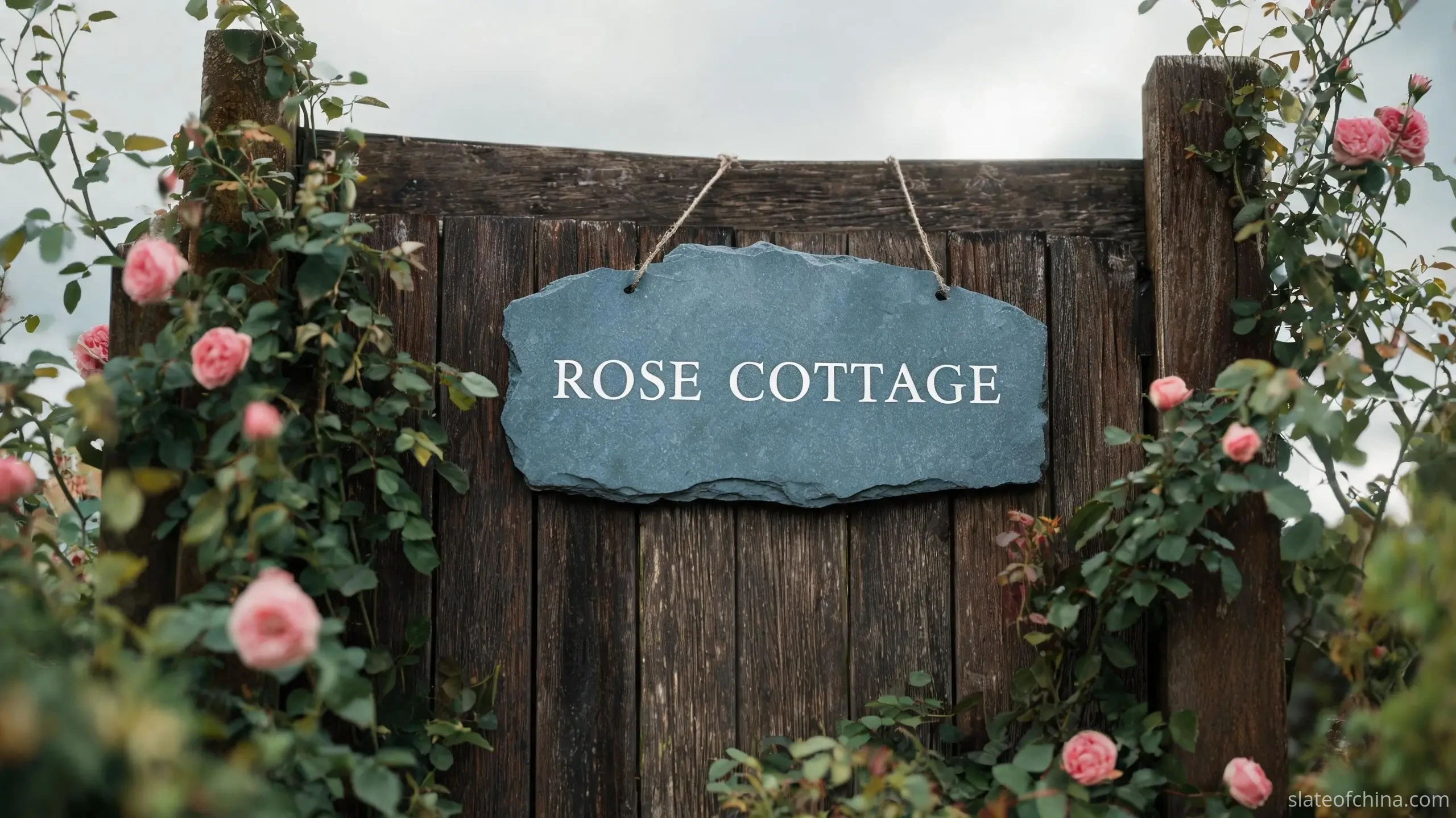
Personalised slate house signs carry a family name, a house name or a cottage name. Britain's stock of named houses — Rose Cottage, The Old Mill, whatever the family chose — makes this a category of its own, and it is read more slowly than a number: by a visitor at the gate, a postal worker at the door, a guest double-checking an address. The plaque is usually seen from a metre or two, so the quality of the lettering matters as much as its reach.
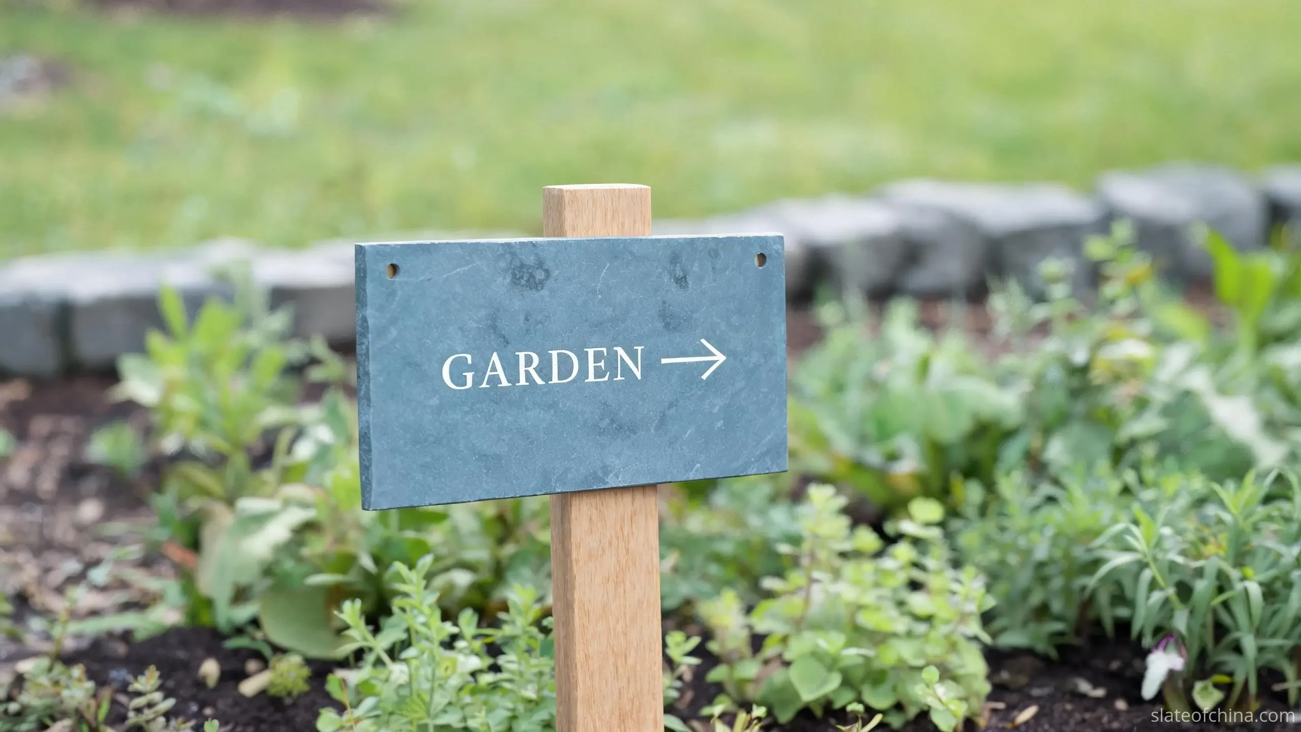
Garden signs and plant markers are read from above and from arm's length — labels for herb beds, row markers for vegetables, names at the foot of a border. They are the wettest environment on this list: sustained contact with soil, splash from watering, and the back of the plaque sitting against damp timber for months at a time. Thickness, support and fixing method matter more here than size does.
Directional and wayfinding signage — pathway arrows, car-park directions, estate and hotel wayfinding — is swept-read at walking or driving pace, and it is usually bought as a set. A coordinated run of slate plaques has one design problem a single plaque does not: natural slate varies from piece to piece, so a series has to be planned around an agreed range of variation rather than an impossible expectation of identical plaques.
Business and entrance plaques take the same stone into commercial settings: practice names, studio numbers, restaurant entrances, hotel lobbies. Here viewing distance, accessibility, local signage rules and maintenance access enter the specification alongside appearance — a business sign that cannot be read from where visitors park is a failed sign, whatever it costs. Large entrance plaques reach sizes where the fixing design, not the lettering, becomes the engineering problem.
Memorial and commemorative plaques are the slow-reading end of the family — benches, gardens of remembrance, walls of names — and they get a section of their own later in this guide, because almost every rule that serves the two-second read is inverted for them.
The smaller slate gift family — coasters, placemats and serving boards — shares the marking workshop but not the weather; and the sign family's closest relatives in the catalogue can be browsed in slate crafts and living products. Whatever the plaque is for, the working order is the same: decide where it will be read, then let that decision drive every line of the specification.
Sizing by Reading Distance
Slate house number plates are sized from the outside in. The chain of reasoning runs: the sign will be read from a distance; that distance demands a minimum numeral height; that height, multiplied by the count of characters, demands a minimum plaque area — and only then does taste get a vote, choosing shape and proportion inside the envelope the reading has already drawn. A plaque bought the other way round, by appearance first, is how houses end up with beautiful dark rectangles that visitors drive past twice.
That chain has one link worth naming outright: the letter height is decided first, and the plaque size follows from it — not the reverse. A single number and a long house name ask for different usable areas at the same legibility; a number read from the road needs taller characters than the same number read at the door; and the weight of the typeface, the spacing between characters, the lighting on the wall and the contrast behind the stone each bend what a given dimension delivers. It is also why no single plate size serves as a universal residential standard — the ranges below are starting territory, not sizes to buy blind.
| Application | Illustrative dimensions | Typical use |
|---|---|---|
| Compact number plate | 100 × 75 mm to 150 × 100 mm | A single house number, read at the door |
| Standard house sign | 200 × 100 mm to 300 × 150 mm | Number plus a short street or family name |
| Personalised house plaque | 300 × 150 mm to 400 × 200 mm | A house or property name, read from the gate |
| Garden identification plaque | 100 × 50 mm to 200 × 100 mm | Plant, bed and pathway labels, read at arm's length |
| Large entrance sign | 400 mm and above in one dimension | Building names and commercial entrances, read from a road |
These ranges are illustrative design territory, not industry standards — actual requirements fall outside them whenever the wording, the viewing distance or the wall says so.
What size slate house number sign do I need?
Work from the reading distance, not the catalogue. A single number read at the door is comfortable on a compact 100 × 75 mm to 150 × 100 mm plate; the same number read from a road needs a larger face with taller numerals, typically 200 × 100 mm or 300 × 150 mm; a house name read from a gate moves up to the 300–400 mm class. A practical self-check: print the layout at true size, tape it where the plaque will hang, and read it from where a visitor or driver will actually pass. If it fails, the numerals are the thing to enlarge — not the plaque.
Thickness follows a shorter argument. Thin plaques suit small, well-supported signs fixed close against a flat surface; larger faces, exposed positions and any sign with unsupported edges or standoff fixings need a more substantial section, because slate is relatively brittle under impact and concentrated stress, and the risk rises with every unsupported millimetre. There is no single right thickness for every outdoor slate sign — the honest answer is that the manufacturer should be asked to recommend a gauge for the finished dimensions and the chosen fixing, and be able to say why.
Shape carries meaning more than performance. Rectangles are the workhorse — practical for numbers and longer names, and the easiest shape to cut, pack and replace. Squares suit compact designs; circular and custom outlines give a project its own silhouette, at the cost of additional cutting, finishing and inspection. Natural-edge pieces keep the stone's original broken outline and read as more rustic; they belong to cottages and gardens more than to contemporary entrances. Bespoke outlines are justified where a visual identity genuinely needs them — otherwise a clean straight-cut edge, done well, is the quieter mark of quality.
Proportion is the last decision, and the street settles that one too: a wide rectangle suits a long name hung at eye level; a taller plaque suits a gatepost read from a car; and a square plate reads as deliberate and orderly on rendered walls. Pace out where the reader will stand, hold a print at that distance, and the proportion question settles itself.
Lettering for Two Seconds and One Metre
A slate sign is read in two registers. From the road, the reading is a two-second judgement: shape, contrast, numeral size — done. At the door, the reading is a one-metre inspection: the quality of the letterform, the crispness of the engraved edge, the evenness of any paint fill. A good slate house sign passes both; a poorly specified one passes only the second, because its lettering looked handsome in the maker's photograph and vanished from a passing car.
Font choice sits between the two. Simple, well-spaced letterforms read from distance far better than decorative scripts; the more ornate the typeface, the sooner it dissolves into texture. Traditional serif lettering suits cottages and heritage buildings and earns its keep at close range; clean sans-serif faces suit contemporary architecture and distance reading alike. Long names are the test case: legibility should be allowed to overrule decoration, and very fine hairlines or small characters are difficult to reproduce cleanly on textured stone — a consideration that also feeds back into the surface finish chosen at the production stage.
Contrast is decided in real light, not studio light. White and pale lettering against dark slate gives the strongest pairing and the one most sign buyers should default to; silver and gold paint-fills trade some of that contrast for warmth and work well where lighting is reliable. The honest check is unglamorous: assess any proposed design at dusk, in shade, and in rain, under the conditions where delivery rounds actually happen. What the lettering must not rely on is a single reading at noon.
Three marking methods carry the text, and each ages differently. Unfilled engraving cuts letters into the stone and lets the pale cut face do the contrasting — the most understated finish, and the one whose readability depends most on lighting angle. Paint-filled engraving adds a contrasting exterior-grade paint into the cut, giving the sharpest long-distance performance, on the understanding that the paint layer is a maintenance item on a different clock from the stone itself. Printed graphics reproduce the most complex artwork — the full comparison of engraving, screen printing and UV digital printing, with what each survives, is set out in the guide to engraved and custom-printed slate; for outdoor signs the trade-off always comes back to the same axis: how permanent the mark must be, and how much repaint or renewal is acceptable.
| Marking method | What it gives the sign | What to confirm at purchase |
|---|---|---|
| Unfilled engraving | A physical cut in the stone that cannot peel or wash off | How the cut face reads under real lighting; letter size on textured faces |
| Paint-filled engraving | The strongest contrast on dark slate, and the classic sign appearance | The exterior grade of the paint, and the renewal cycle it implies |
| Screen printing | Economical for longer runs of simpler, single- or few-colour artwork | Screen setup costs, colour consistency across the run, adhesion on stone |
| UV digital printing | Full-colour and complex artwork, variable data, short runs | Outdoor ink system, white underbase on dark slate, long-term adhesion |
General characteristics only — which methods an order can actually use depends on the supplier's equipment and the facilities it coordinates; confirming that, in writing, belongs to the capability questions in the sourcing and quotation sections below.
Before production, the artwork should be approved in a form that fixes six things: exact wording, spelling and punctuation; typeface and capitalisation; layout and alignment; dimensions and orientation; lettering colour and marking method; and the position of fixing holes where there are any. For wholesale and repeat orders, the approved file should be retained as the reference for every later batch. Then apply the field test: shrink the proof to its true on-stone size on a phone screen, hold it at arm's length from across a room, and read it once without stopping. That ungenerous glance is the test the plaque has to pass for years.
Weatherproofing Without Promises
This section deliberately avoids the vocabulary of guarantees. Natural slate plaques can serve for decades as outdoor signs — the evidence is standing in churchyards and on gateposts across Britain — but performance outdoors is a property of the specific stone, its condition, its fixing and its climate, not a property of the word slate. What a buyer can do is specify, ask and check; what a supplier can honestly offer is material chosen for the exposure and, where relevant, test information.
Water is the working variable. Lower water absorption means less of the rain arriving on the face becomes the stone's problem rather than the weather's — and in climates with repeated freeze-thaw cycles, water held in pores, cracks or weak mineral layers is the mechanism behind most winter deterioration. The physics of this figure, and why it decides so much about outdoor slate generally, is covered in the guide to water absorption; for sign buying the practical rule is simpler. Ask the supplier what the material's absorption characteristics are, ask what defects are excluded, and treat a refusal to discuss either as information.
Absorption alone is not the whole story, and no responsible specification treats it as such. An existing crack or a soft mineral vein will take in water whatever the body of the stone does; the same applies to open drill holes and unsealed cut edges. This is one reason the inspection stage of production matters for signs more than for many other slate products: a plaque that leaves the workshop sound, uncracked and within spec starts its outdoor life from a defensible position.
Colour stability earns a careful distinction. Slate's greys, blue-greys and near-blacks come from its mineral make-up and do not fade the way a pigment does; what changes on an installed plaque is surface condition — dirt, biological growth, the ageing of any sealer, and the weathering of any paint or printed layer. The stone and its letters age on different clocks. Engraved lettering is not a coating and cannot peel; paint fills and printed art are surface systems whose exterior grade and expected renewal cycle belong in the specification, not in a footnote. Sunlight does the stone no measurable harm, but it is the enemy of untested adhesives, cheap inks and un-rated paints — a detail that matters most for applied letters and composite fixings.
The practical conclusion: outdoor slate signs are a sound choice where the material grade suits the climate, the lettering system is rated for exterior use, and the installation lets water leave rather than collect. Where any of those three is unknown, the order of operations is to establish it — by question, by sample, or by test report — before the plaque catches its first winter.
From Blank Slate to Fixed Plaque
Custom slate signs move through six stations between an enquiry and a courier. Knowing them in order is what separates a buyer who specifies a product from a buyer who describes a picture, and it is the sequence a good supplier will follow whether or not it is spelled out.
Station one: selecting the slate. The maker chooses material to suit the finished dimensions and the application — colour, thickness, how the stone splits, what defects are visible, and how much clean usable face the wording needs. Small number plates live or die on the look of that face; large entrance plaques add flatness and thickness consistency to the criteria, for reasons the fixing stage will make obvious.
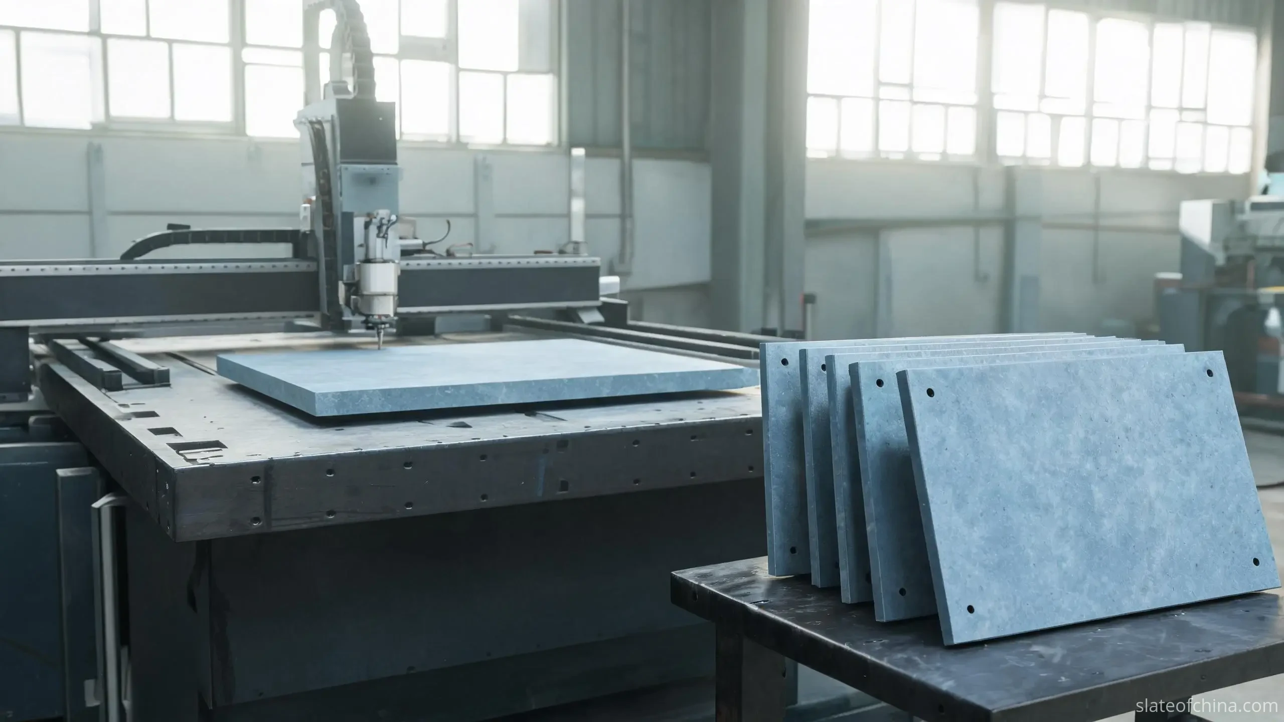
Station two: cutting and shaping. The blank is cut to the agreed outline, whether a straight-edged rectangle for a coordinated run of signage or a natural-edge piece for a cottage wall. Custom outlines and radii need more cutting, more edge finishing and more inspection than standard shapes — which is why dimensioned drawings are worth preparing before pricing, not after, and why unusual shapes are quoted as their own line rather than as rectangles with a surcharge.
Station three: surface preparation. The face finish is set here, and it conspires with the lettering: a natural split surface carries the stone's living texture and reads well with larger letterforms, while honed or flatter surfaces suit small text, detailed logos and precise layouts. The finish should be confirmed on a physical sample or a clear production reference, not described in words alone — the difference between "riven" and "honed" is worth paragraphs of argument and disappears in one touch.
Station four: marking. The lettering method chosen earlier — unfilled engraving, paint-filled engraving or printing — is executed on the prepared face. At this station our workshop works to one fixed habit regardless of customer: no mark goes onto stone until the wording and layout have come back confirmed in writing. The reason is arithmetic rather than ceremony; a typo in a memorandum is an inconvenience, and a typo cut forty millimetres deep into a stone plaque is a different object entirely. How each method actually performs, and what to verify on its sample, is covered in the marking guide.
Station five: drilling and mounting preparation. Fixing holes, slots or standoff points are machined while the piece is still flat on the bench. Hole diameter, edge distance and plaque thickness all bear on whether the fixing survives the next decade — holes placed too close to an edge concentrate stress exactly where slate tolerates it least, and the wall behind a heavy plaque must be asked, honestly, whether it wants the job.
Station six: inspection and packing. Dimensions, appearance, lettering, hole positions and quantities are checked against the confirmed artwork; for personalised products, spelling and alignment head the list. Then the packing — individual separation, cushioning and a rigid carton or crate are what carry a finished plaque through transit with its edges intact. Stone that has survived cutting and lettering can still be lost to a badly packed corner.
Fittings and Fixings
A well-made plaque fails, when it fails, at the fixing — and the failures are almost always traceable to a specification that stopped at the lettering. The fixing system has to suit three things at once: the weight of the stone, the material behind it, and the weather that arrives at the wall. A plaque heavy enough to look permanent has to be fixed like something permanent.
Wall-mounted signs are usually fixed with mechanical fasteners — screws with appropriate plugs, or brackets for heavier pieces — and, where the substrate allows, adhesive systems rated for the stone, the wall, the outdoor exposure and the load. The adhesive route deserves the same scepticism as any specification promise: it should be used only where the rating is explicit and the surface prepared per the adhesive maker's instructions, and it is at its least trustworthy on dusty, painted or crumbling masonry. For heavier entrance plaques, mechanical fixing is the conservative answer that never goes out of date.
Gateposts and pillars add geometry to the problem. Fixings placed near the edge of a plaque put working stress into the stone's least forgiving zone, so hole positions should be generous with the borders of the piece. Where the sign sits where wind or a garden gate closing at speed can reach it, the fixing arrangement should be designed for the knock, not merely for the calm day someone inspected it.
Freestanding and post-mounted signs — estate boards, directional plaques, name posts — need support engineered to carry the stone and whatever moment a gust applies to it. A thin plaque does not become suitable for unsupported installation because it was sold as outdoor slate; if it stands on a post, the post and bracket are structural components and should be specified like them.
Moisture detailing is the quiet fourth rule. Installations should avoid trapping water — behind the plaque, in countersunk holes, along seams — because water held against the stone through a freeze is the scenario both the material and the fixing least enjoy. Standoff fixings and small spacers that let the back of the plaque breathe, compatible screws that will not stain, and drainage away from the base of post-mounted boards are the details worth naming in the order rather than hoping for on the day.
Height and angle complete the specification, and they bend the argument back to its beginning. A house number read from a passing car wants a position and angle aimed at the road; a name plaque by a front door wants the eye level of someone standing at it with wet shopping bags. Stand where the reader stands, hold the print or a cardboard template on the wall before a single hole is drilled — it is the cheapest five minutes in the whole project.
Slate Against Five Other Materials
Slate is not automatically the answer to every signage question, and a supplier who says otherwise is selling rather than advising. Put beside its five usual rivals, the material's strengths and limits stand out cleanly — and so do theirs. Metal delivers precise lettering and slim profiles; plastics are light and economical; ceramics carry colour beautifully; timber brings warmth and takes a screw as if born to it; engineered composites hold consistency that geology never offered. The serious question is not which material is best, but which material's profile matches the plaque's job.
| Material | Main strengths | Considerations |
|---|---|---|
| Natural slate | Authentic stone texture, engraving that cannot peel, weight that reads as permanence | Brittle under point impact; natural variation; heavier than the alternatives |
| Metal | Precise lettering, slim profile, engineered consistency | Appearance and corrosion behaviour depend entirely on the metal and its finish |
| Plastic | Lightweight, economical, quick to replace | Long-term appearance and weathering vary widely by polymer and exposure |
| Ceramic | Rich decorative possibilities, strong colour options | Can be brittle; outdoor suitability depends on the specific product and fixing |
| Wood | Warm natural appearance, easy to customise and repair | Generally needs more outdoor maintenance, depending on species and finish |
| Manufactured stone / composite | Consistent shapes and colours, factory repeatability | Appearance and performance depend on composition and manufacturing quality |
The honest cases against slate are three: a project that needs the lightest possible plaque slung on a fragile substrate; artwork that lives on extensive multicolour graphics; and an application where frequent replacement is expected and priced in. In those cases another material is simply the better tool. Equally, the cases for slate are not about superiority but about fit — when the buyer wants a material that carries its age well, lettering cut into the stone rather than suspended above it, and a physical presence on the wall that no polymer reproduces honestly, slate is not competing with the others so much as standing slightly apart from the contest.
Low Care Is Not Zero Care
The attractive claim about slate signage is that it looks after itself; the accurate claim is that it asks for much less routine care than painted timber or lacquered metal, and still asks. What follows is the whole of the maintenance subject, in an honest paragraph apiece.
Ordinary dirt — dust, road film, splash — comes off with a soft cloth, water and a mild cleaning approach appropriate to the stone's finish. What to avoid is shorter than the acceptable list: abrasive pads and grit-bearing cleaners, wire brushes, and any acid- or alkaline-based chemical that has not been tested on this slate with this finish. And because the sign's readability lives as much in its lettering as in its face, no cleaning decision should be taken on a paint-filled or printed plaque without the marking method in mind — a pad that leaves the stone untouched can still take a fill coat down to flecks.
Scheduled checks can be brief, since there are only four subjects: the lettering (wear, lifting or flaking of any paint fill), the fixings (movement, corrosion, a screw wandering loose behind a stainless cap), the surrounds of the plaque (a joint or a plant-base that has begun to hold water against the stone), and — on shaded or north-facing walls — biological growth, the green film that arrives uninvited where light and airflow are scarce. The interval between checks is a function of local weather and exposure, not a number on a warranty card; coastal and heavily shaded installations deserve the more frequent eye.
Wholesale Buyers and the Consistent Batch
For retailers, garden-centre buyers, gift brands, landscape contractors and signage distributors, slate signs are a trade product, and the sourcing conversation should be a specification conversation. The buyers who have the fewest problems with repeat batches are the ones who wrote down what they expected before the first cut, in seven headings: the slate type and its acceptable colour variation; length, width and thickness; edge treatment and surface finish; lettering method and artwork requirements; hole positions and mounting accessories; quantity and packaging; and the inspection criteria with agreed allowance for natural characteristics. A written specification of that shape is what keeps the third batch looking like the first — and saves misunderstandings from being discovered at the unboxing stage, on a customer's loading bay.
Customisation capability is the next audit. Which sizes, shapes, layout styles and lettering options can the supplier actually produce in-house; for private-label programmes, are branded packaging, barcode labels and custom cartons offered; and for detail-heavy artwork, can a production sample or a photograph of a representative finished piece be provided before the run? Small text and fine graphics are exactly where supplier capability diverges, and a photograph of the real item — not a mock-up — is the evidence that settles it. Much of the marking itself runs on partner facilities rather than the stone workshop's own floor; the capability questions above are how a buyer finds that out early, in a supplier's own words, rather than after a deposit.
Quantities follow the manufacturing logic of the product. Standard straight-cut plaques in agreed sizes let a supplier run efficient batches and are typically available at lower minimums; bespoke shapes, specialist finishes and custom packaging tend to need larger commitments to make a run worth setting up. Sensible practice is to price the same specification at sample quantity, trial quantity and repeat volume in the same enquiry, so the comparison is between the same product at three stages rather than three products. Wholesale slate signs — the term the trade searches under — are quoted that way every day, and a supplier who can only quote one number for one quantity is telling you something about how the price was built.
Packing is the wholesale buyer's quiet profit margin, because transit damage is the cost that arrives after the invoice is settled. Most of what leaves this workshop is heading for overseas distribution rather than a single local gate, and the standard — individual edge protection, interleaving, cushioned cartons, palletisation or wooden crates scaled to the shipment — is documented in detail in the guide to slate packing and shipping. Retail-ready packaging has to survive the same ocean as bulk cartons, so it should be confirmed as a tested compromise between shelf presentation and transit protection, not assumed. Before the first order, the inspection and acceptance basis belongs in writing too: what counts as acceptable natural variation within a batch, and what counts as a defect.
Consistency across a batch, finally, is a managed expectation rather than a wish. Natural slate varies in tone and grain from piece to piece; the professional handling of that fact is an agreed range — exemplified by a reference pair — inside which every plaque in the order must sit. The alternative, expecting fifty identical plaques, ends with either a disappointed buyer or an increasingly nervous supplier. When checking a delivered batch, the field test beats the sample-room comparison: stand the cartons' contents where a customer will see them — a shelf, a wall display, a run of shopfronts. Batches are judged by how the plaques present together at reading distance, not by how closely two of them match under a desk lamp.
Sourcing Custom Slate Signs from Jiujiang, China
The slate belt centred on Jiujiang in Jiangxi Province is a working quarry-and-workshop region — the supply base behind the roofing slate, billiard beds, paving and craft products described across this guide. Signs are a small-format product of the same industry, and how an order is actually coordinated there tells a buyer more than any capability statement, because in this trade the stone and the marking rarely come from the same bench.
- Material by format. A compact number plate and a large entrance plaque pull on different parts of the same raw stock: the small plaque selects for face appearance and lettering area, the large one for flatness, thickness consistency and the fixing loads it must carry. The producer's material selection is the first thing a buyer's specification should reach.
- Stages routed as one sequence. Cutting, surface finishing, lettering and drilling are scheduled together — shape before mark, holes while the piece still lies flat — and a supplier who can describe that routing in order is describing control rather than improvisation.
- Checks scaled to quantity. A single custom sign is verified against its proof; a batch adds first-article inspection, per-design artwork checks and per-carton counts before anything is packed for export.
- Batches held by evidence, not memory. Repeat orders run against retained approved artwork and a physical reference pair, which is how the third delivery still looks like the first and how the stone's natural variation stays inside an agreed range.
- Marking confirmed on samples. Not every stone workshop runs its own laser or print line — in this trade much of the marking is coordinated — so the workable basis is a pre-production sample showing the actual mark on the actual stone, plus a straight answer on which stages are in-house and which are coordinated.
None of this is unique to a single factory. It is what an organised slate supply chain in the region looks like when it is working, and it is what a buyer should be listening for underneath the capability statements. The sourcing route itself — factory-direct versus trading desk, and what each means for a sign programme — has a guide of its own.
The Inquiry That Gets a Straight Quote
Quotations improve in direct proportion to the enquiry, and the quotation that arrives as one number with no anatomy is the one that ends in an argument. The efficient enquiry for custom slate house signs and plaques carries ten pieces of information; a supplier worth quoting from will ask for exactly these before committing a price.
| # | What to state | Why it changes the price or the product |
|---|---|---|
| 1 | Application | Number plate, name sign, garden marker, wayfinding or memorial — the use sets thickness, finish and marking options |
| 2 | Finished dimensions | Length, width and thickness drive yield from the slab and the fixing design |
| 3 | Shape and edge | Straight-cut, square, round, natural edge or bespoke outline — each is a different cutting and finishing job |
| 4 | Surface finish | Natural split or honed face changes both appearance and lettering options |
| 5 | Lettering method | Engraved, paint-filled or printed — the cost and the durability both follow this line |
| 6 | Artwork | Text, logo, reference photo or dimensioned drawing; the clearer the file, the firmer the proof |
| 7 | Mounting | Hole positions, brackets, posts or adhesive — machining and accessories are priced here |
| 8 | Quantities | Sample, first order and expected repeat volume — three numbers invite a three-stage price |
| 9 | Packaging | Individual box, protective carton, pallet or export crate; retail-ready adds a specification of its own |
| 10 | Destination | Delivery country and preferred shipping route, plus any project-specific compliance needs |
Where the design is still unsettled, a reference photograph and approximate dimensions are a legitimate starting point — the quotation comes back as a range with assumptions attached, which is still more useful than a single number guessed at. What to ask of the quote itself is separation: the plaque, the customisation, the packaging, any tooling or setup charges, and the transport, each on its own line. A price presented that way can be compared with another price like it; a single total cannot. Before committing a production run, the remaining step is a sample: how to approve one fairly — and what it can and cannot tell you — is covered in the guide to samples and sample approval, and the wider set of questions worth putting to a slate supplier has its own checklist.
Plaques Read Slowly
The street asks for two seconds. A memorial asks for minutes — for a family to stand still in front of it, with time on their hands and no hurry in their reading. Slate memorial plaques belong to the same production chain as every product above: the same stone, the same cutting, the same marking methods. What changes is the weight the words carry, and that weight reaches all the way back into the specification.
Four engineering habits follow. First, wording is sacred, so no memorial order moves to the saw until the family or the client has confirmed the text, spelling and dates in writing; on a plaque that will outlive everyone in the room, "close enough" is not a category. Second, letter depth and fill are chosen for decades of weather — paint-filled engraving touched up with exterior-grade fill, or unfilled lettering deep enough to hold its shadow through years of rain. Third, the fixing is designed for a permanent installation with a margin, not for a best case; a plaque on a memorial wall or a bench back should be attached as if no one will check it for years, because no one will. Fourth, the exposure budget is generous: shaded, damp, frost-prone sites are common for memorials, and the stone selection and surface detailing should be made knowing that.
The lettering style takes its tone from the same patience. Traditional serif forms with generous spacing suit memorial work well; they were, after all, largely designed for it — cut into stone by people who understood the light would change and the reader would be standing still. This is the one branch of the slate sign family where contemporary minimalism is a deliberate choice rather than a default, and it is also the branch where the two-second rule — the argument of this whole page — quietly suspends itself.
Which is the honest closing note for the subject as a whole. For a house number, a business plaque, a wayfinding run or a garden marker, the specification has its natural origin and its natural judge: start at the street, work backwards through reading distance, lettering, material and fixing, and almost every decision takes care of itself. For the plaques that are read slowly, start at the bench. Most slate signs live somewhere between the two — passed at speed today, read properly by the person who was looking for them — and the best of them are specified by someone who understood, before the stone was cut, exactly which of those readings mattered most.
Frequently Asked Questions
The questions below are the ones that come up most often when buyers plan a slate sign — from a single cottage number to a wholesale programme. Each answer gives the verdict first, then the reasoning; where a topic needs a full treatment, the sections above carry it.
Are slate house signs weatherproof?
Suitable natural slate performs well outdoors — the surviving examples in churchyards and on period gateposts are the evidence — but weather resistance belongs to the specific stone, its condition, the climate and the fixing, never to the material name on its own. For exposed or freeze-thaw locations, ask the supplier about the material's water absorption characteristics, what defects are excluded, and whether test information is available, then choose the lettering system and installation to match. That is the honest version of "weatherproof".
Do the letters on engraved slate signs fade outdoors?
The engraved cut itself does not fade in the way a surface print does — it is a physical change to the stone, not a coating. What changes is visibility, and for three separate reasons: dirt and biological film can soften the contrast of unfilled engraving; paint-filled letters age with the paint, not the stone, and eventually need renewal; and printed artwork lasts only as long as its ink system is rated for exterior use. A sign maintained as described in the care section keeps its readability for many years, whichever method carries the text.
Can slate house signs be personalised with a house name?
Yes — house names, family names, cottage names and short messages are the classic application, especially in Britain, where named houses are a tradition of their own. The practical points are surface area and letter count: a longer name needs a wider plaque or a more compact typeface, and the layout should be approved as a proof before cutting. Expect the wording to be confirmed in writing; with engraving, corrections are not an option.
How should an outdoor slate sign be fixed to a brick wall?
Most house signs are fixed with screws and wall plugs suited to masonry, or with standoff fixings that hold the plaque slightly clear of the wall and let trapped moisture escape. Adhesives can work on sound, clean brick where the product is explicitly rated for the stone and the exposure, but they are the least forgiving option on painted, dusty or weathered surfaces. Keep holes well clear of the plaque's edges, and match screws to their environment — stainless or coated fixings where rust staining would matter.
Are slate garden signs good for plant labels?
They are a strong choice — stone that tolerates wet soil, splash and frost, with lettering that does not wash off in a season. The specification should match the use: smaller plates for plant and bed labels, a thicker piece or a mounted plaque for anything standing in soil, and an engraved or paint-filled finish rather than surface printing, since plant labels take constant handling and cleaning. Thin wall plaques are not ground stakes; if the sign stands, it needs the right support.
How do you clean an outdoor slate sign?
Soft cloth, water and a mild cleaning method appropriate to the finish — that handles dust and road film. Avoid abrasive pads, wire brushes and any untested acidic or alkaline-based product, and treat any paint-filled or printed letters as the most delicate part of the sign. For shaded and damp positions, an occasional look for biological growth and a check of the fixings completes the routine; how often depends on the exposure, not a fixed interval.
Is slate better than metal or plastic for house signs?
Better at some things, not at everything — which is the honest answer for any material pair. Slate offers stone texture, engraving that cannot peel, and physical presence; metal offers precision and slim profiles; plastic offers lightness and low cost, and replaces easily. Choose slate when permanence, material character and cut lettering matter most, and choose another material when lightness, multicolour graphics or planned replacement dominate the brief.
Can slate house signs be supplied with pre-drilled holes and mounting hardware?
Yes — drilling is part of the production sequence, done on the bench before the lettering stage, so pre-drilled holes are a standard request rather than a modification. Give hole diameter, positions and edge distance with the artwork, and confirm the fixing route they serve — screws and plugs, or standoffs that hold the plaque clear of the wall. Whether mounting hardware itself is included (screws, caps, brackets) varies by supplier and should have its own line on the order; where it is not included, exterior-rated stainless or coated fixings are the safe local purchase.
What information is needed for a wholesale slate sign quotation?
The ten-line enquiry in the quotation section above is the full answer: application, finished dimensions, shape and edge, surface finish, lettering method, artwork, mounting, quantities at sample / trial / repeat stages, packaging, and destination with any compliance needs. Sent as a written specification rather than a photo of a design found elsewhere, it invites the itemised quote described in the wholesale section — plaque, customisation, packaging, tooling and transport separated — which is the kind that can genuinely be compared between suppliers.
Related Reading
Planning a single slate sign — or a programme of them? Tell us where it will hang and how far away it will be read, and the specification follows. Every enquiry is quoted itemised: plaque, marking, mounting and packing on separate lines.
- Application: house number, name plaque, garden sign, wayfinding run or memorial
- Reading distance: where the reader will stand or pass — street, gate or path
- Wording & artwork: exact text, logo or dimensioned drawing
- Finish & fixing: surface finish, lettering method, hole positions or mounts
- Quantity: single custom sign or a wholesale / private-label batch
- Destination: delivery country and preferred packaging or shipping terms
Undecided on lettering or finish? Send the wording and a photo of the wall first — a proof and a sample plan come back before anything is cut.