
Interior Slate Feature Walls: Design and Panel Selection
Reading a wall at two distances – the colour rhythm from across the room, the edges and joints from an armchair.
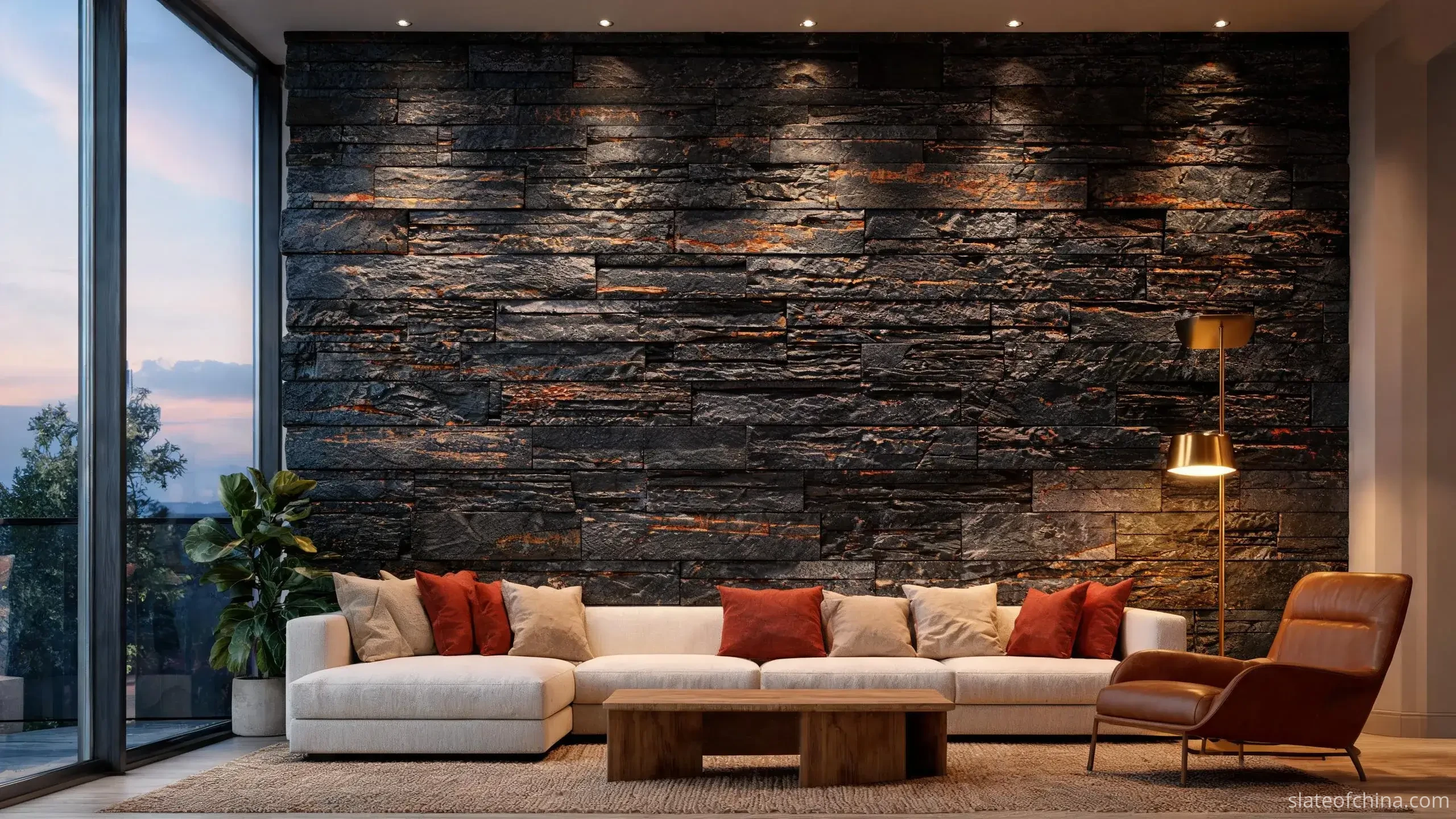
Two people share a room in the evening. One is folded into the sofa across the room, glass in hand, not looking at anything in particular. The other has taken the armchair by the wall, close enough to rest a hand on the stone. They are looking at the same slate feature wall, and they are seeing two different walls.
From the sofa, the wall is a composition: a grey field with a quiet rhythm of courses, one rust-coloured streak catching the lamplight like a signature. From the armchair, the wall is a material: the fine ridges of a cleft face, the shadow line where one panel steps proud of the next, a joint that runs true for a metre and then wanders. Both people are right. Both readings happen every evening, in every room that carries stone.
That is the whole difficulty of designing with natural slate indoors, and its whole appeal. A painted wall tries to look identical from every chair in the room. Slate never does. It changes with distance, with light, with the hour. A wall that was designed for one reading and not the other is the wall that looked perfect in the showroom and disappointing at home: flawless as a composition and careless as a material, or the reverse.
This guide designs the wall twice, on purpose. It builds the far reading first – how to choose slate wall panels, how to build a colour palette, how much rhythm the room can hold. Then it walks to the chair and designs the near reading – texture, edges, joints, lighting, and the details that decide whether the wall rewards a slow look. It closes with the practical half: the rooms themselves, the questions to settle before installation, the mistakes that repeat, and what to agree with a supplier before the stone is cut. It is written for interior designers, architects, homeowners and stone buyers – anyone who wants an interior slate feature wall that was designed rather than assembled.
ACROSS THE ROOM — judge the wall as a composition: the colour family and how lighter and darker pieces are distributed, the panel format and its rhythm, the proportion of the layout, and how all of it sits with the furniture, the daylight and the size of the room.
FROM AN ARMCHAIR — judge the wall as a material: the cleft texture under close light, the quality of edges and corners, the width and alignment of joints, the transitions to plaster, timber and cabinetry, and whether the lighting flatters the stone or exposes the installation.
A natural slate feature wall succeeds when both readings were designed on purpose. It fails quietly, and expensively, when only one of them was.
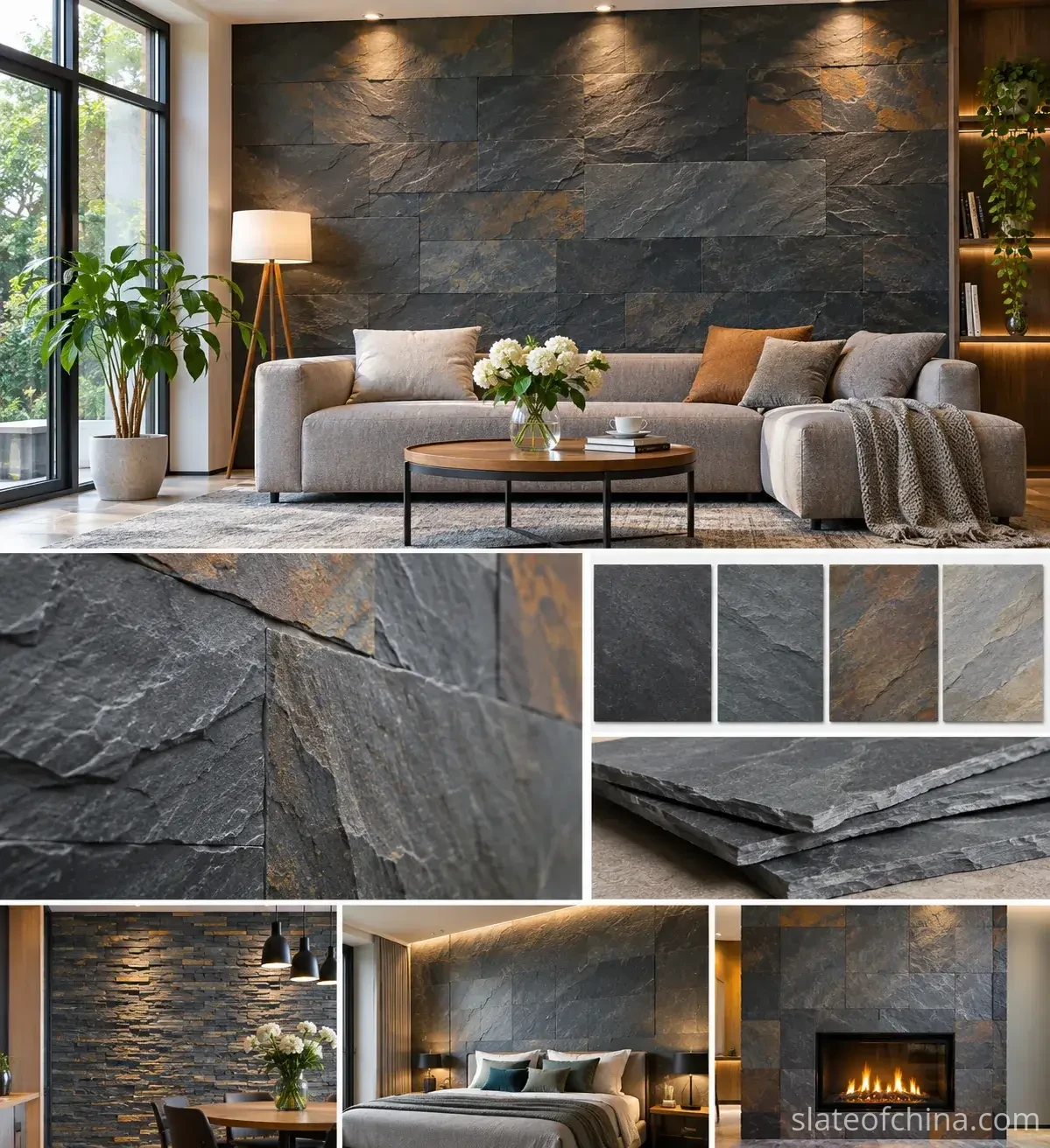
Two Distances, One Wall
Begin with an honest fact about eyes: nobody inspects a wall tile by tile. At conversational distance the eye reads a field. It takes in the colour family, the balance of lighter and darker pieces, the coursing of the panels, and – in a second or two – whether the wall feels calm or busy, intentional or accidental. Design for that second or two. It is the one your guests will actually have.
Three questions, asked from the doorway, settle most of the far reading before a single sample is ordered:
- Is this wall meant to be a calm background or a focal point – and does the stone you are choosing agree with that role?
- Are the strongest colour variations placed on purpose, or just wherever they happened to land?
- Does the panel layout respect the dimensions of the wall and the furniture standing against it?
The cheapest design tool for the far reading is a phone. Lay a dozen pieces on the floor in the intended pattern, walk back three or four metres, and take one photograph. Viewed casually on a small screen, colour patches announce themselves, accidental stripes line up, and a layout that felt balanced at kneeling distance can suddenly look lopsided. Fixing a patch at this stage costs nothing but the effort of swapping two pieces. Fixing it after installation costs a room.
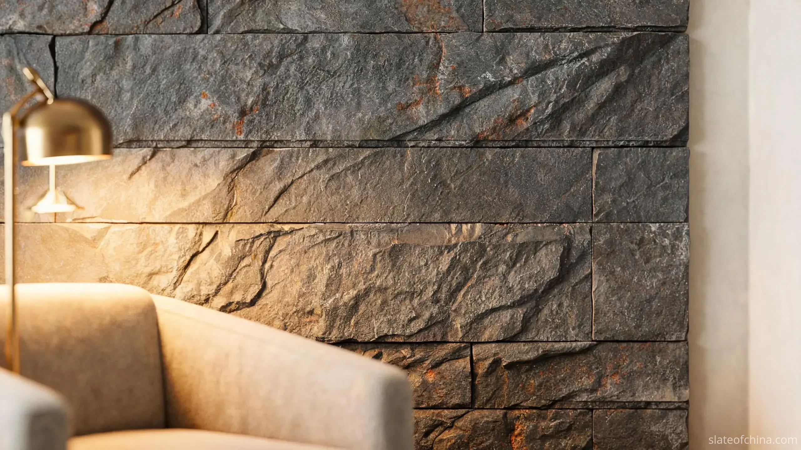
Then take the seat. From an armchair – the nearest place anyone will actually sit and look – the wall stops being a composition and becomes a material. Natural cleft faces catch the light in fine ridges and shallow hollows. Panel edges cut shadow lines. Joints show their width, their alignment, and the precision of whoever set them. This is where the difference shows between a designed stone wall and a collection of attractive tiles: the first was planned at this distance; the second merely survives it.
At seating distance, five things get read whether anyone means to read them or not: sharp projections where a sleeve or a shoulder will catch; joint widths that drift from one course to the next; the quality of edges and exposed corners; thickness steps between neighbouring panels; and the way close light turns texture into either flattery or interrogation.
The working principle for everything that follows is one sentence: a slate feature wall should feel balanced from across the room and finished from an armchair. Each section below is one of those two readings, or a decision that has to serve both.
Panel Formats Set the Rhythm Before Colour Does
Most people begin a slate wall conversation with colour. The first question in how to choose slate wall panels is not colour. It is format, because format sets the rhythm the colour will live inside. Interior slate wall cladding panels arrive in a handful of broad families – the full product map, with formats and indicative figures, is in the slate wall cladding buyer's overview – but for design purposes four formats matter, because each changes what the wall says from across the room.
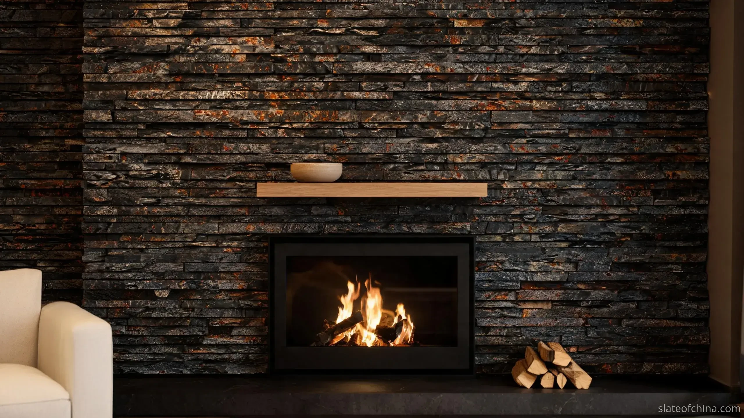
Stacked slate stone panels are narrow strips built into coursed, heavily textured panels. From across the room they read as strata: strong horizontal movement, deep shadow, an unmistakably hand-built character. They suit fireplace surrounds, reception walls and living room accent walls that are meant to carry the room. The caution is relief – the same depth that looks dramatic on a generous wall can feel loud in a narrow passage, or beside a wall people brush past every day.
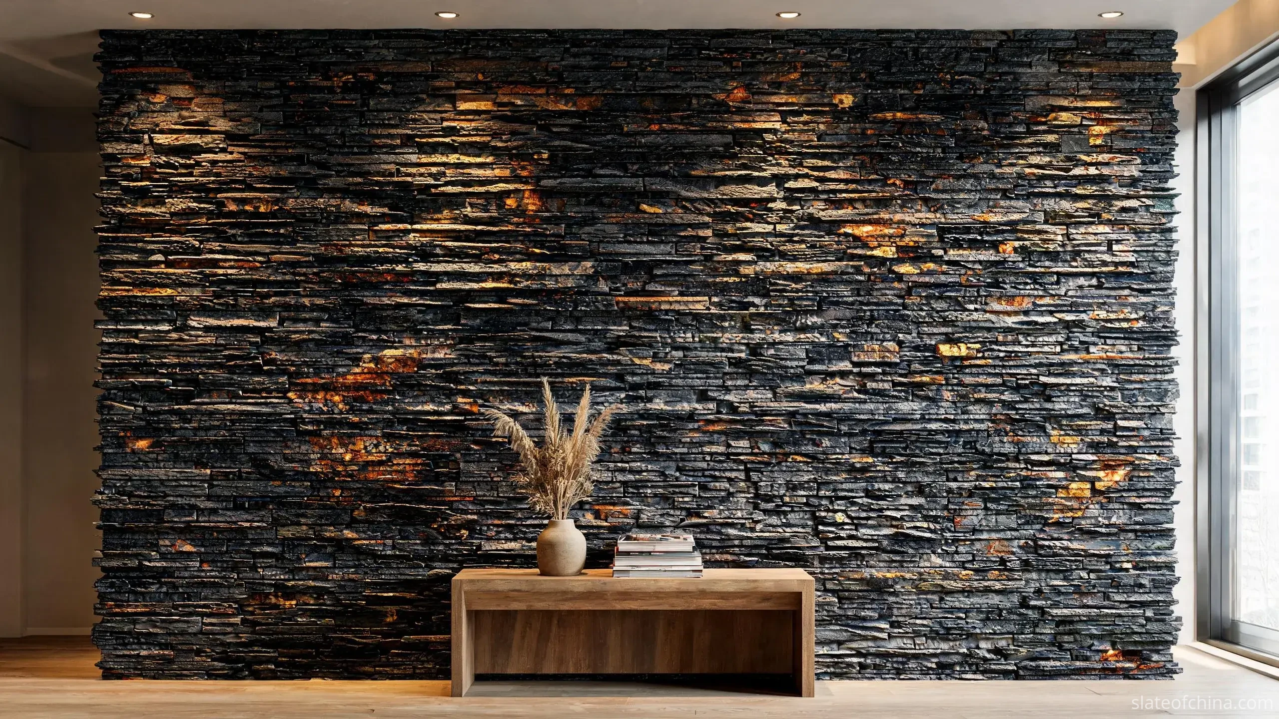
Large-format slate tiles do the opposite. Fewer joints, larger faces, a calmer and more architectural read. The stone itself – its colour drift, its cleft surface – becomes the feature rather than the pattern of the panels. This is the natural choice for minimalist interiors and generous rooms where the wall should hold its ground without shouting. The near reading then carries more of the weight: with few joints to hide behind, edge quality and the flow of colour from tile to tile decide whether the wall reads as one surface or as a row of slabs.
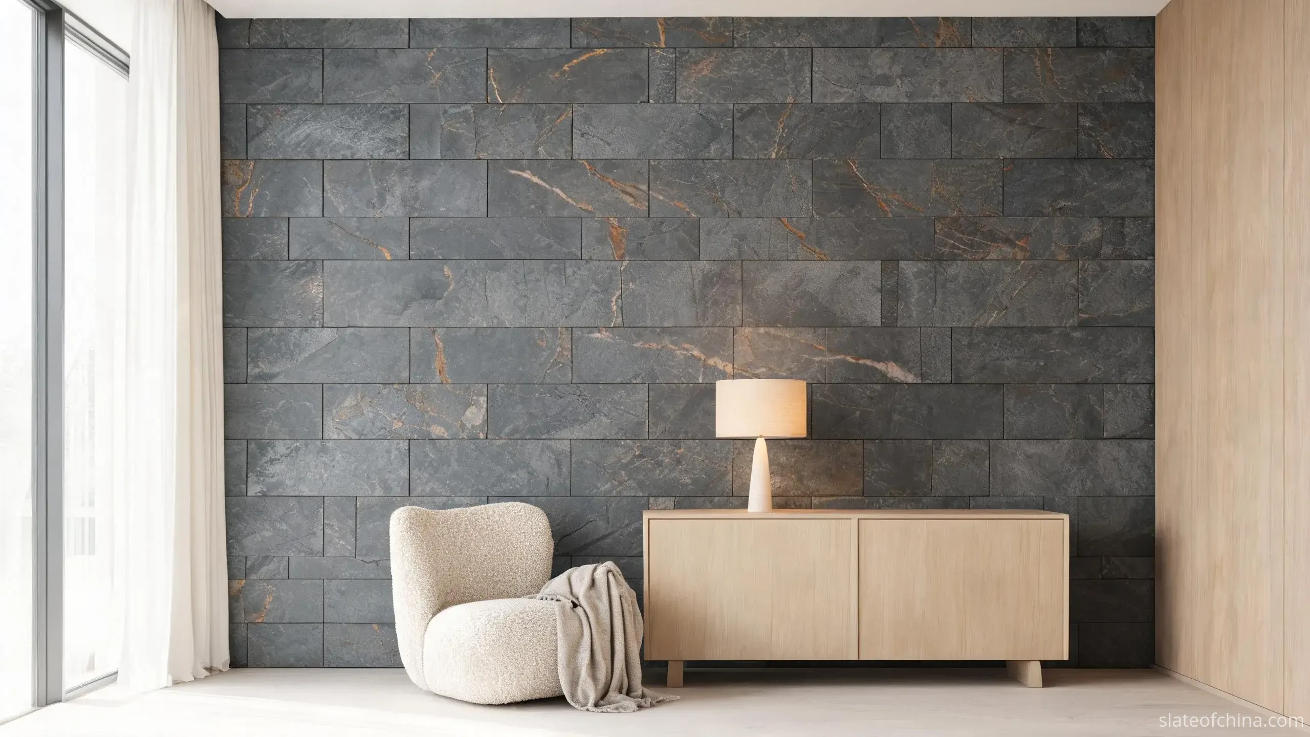
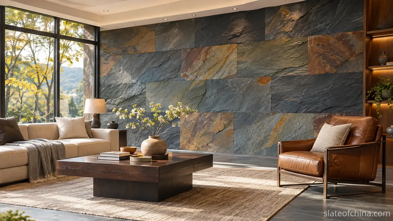
Modular and mixed-size slate panels create an informal, crafted rhythm without deep relief; the mosaic and small-format families have a guide of their own. Varied lengths break the formality of a single module, which makes this the most forgiving format across the room – and the least forgiving at layout stage, where repeated vertical joints, sliver pieces and accidental colour clusters wait for an unplanned wall.
Thin, calibrated slate tiles trade some natural variation in thickness for a controlled, even face. Where the design is detail-sensitive – flush transitions to plaster, precise reveals, furniture butted close to the stone – a calibrated product takes risk out of the near reading. Whether a given line is offered that way depends on the product and the processing; it is a question for the supplier, not an assumption about slate.
| Format | Across the room it reads | From an armchair it demands | Best suited to |
|---|---|---|---|
| Stacked stone panels | Strata: strong coursing, deep shadow | Relief management: projections, cleaning, close-light drama | Fireplaces, feature walls, receptions |
| Large-format tiles | Calm, architectural, stone-forward | Edge quality and tile-to-tile colour flow | Minimalist interiors, spacious rooms |
| Modular, mixed sizes | Informal, crafted rhythm | Layout discipline: joint runs, slivers, colour clusters | Living rooms, dining rooms |
| Thin calibrated tiles | Controlled, even, precise | Flatness and clean transitions | Detail-sensitive walls, furniture-adjacent runs |
Panel dimensions, thicknesses and finishes vary by quarry and manufacturing route; the tables describe design behaviour, not a catalogue. Confirm the actual specification for the exact product – and to see how each family actually ships, the wall cladding slate range shows the formats as they are sold, family by family.
The comparison above reads panel by panel. The question buyers actually ask runs the other way, from the room to the panel. The short decision table below starts each common case – including the best slate panels for a small living room – at its most likely format:
| Project requirement | Recommended starting point |
|---|---|
| Small living room | Flatter slate tiles or moderate-relief modular panels; calm coursing |
| Dramatic fireplace feature | Textured stacked slate panels, with grazing light planned in |
| Minimalist large wall | Large-format rectangular tiles, few and consistent joints |
| Wall close to seating | Controlled relief, carefully finished edges |
| Commercial reception | Format chosen together with load, cleaning and fixing requirements |
Treat these as design starting points rather than a guarantee of installation suitability for any specific product; the confirming questions sit in the supplier conversation near the end of this guide.
ACROSS THE ROOM · the format sets the rhythm – how coursing, scale and pattern will feel at conversation distance, before colour has been discussed at all.
FROM AN ARMCHAIR · the same format sets the texture budget – how much relief, which edges, and how often a joint interrupts the stone at hand distance.
Colour: Choose the Family, Then Design Its Distribution
Natural slate does not arrive as one colour. It arrives as a family – a base tone with mineral markings, subtle veining and piece-to-piece drift. That is not a defect to be managed out; it is the material's whole character. The design task is twofold: choose the family, then design how its variation is distributed across the wall.
Charcoal and black slate give a room a strong architectural anchor. They pair cleanly with pale oak, warm timber, neutral upholstery and disciplined lighting, and in a generous, well-lit room they create a focal point without a drop of bright colour. In a small or day-poor room the same wall can turn heavy. If in doubt, keep the format large, the relief moderate and the surrounding finishes light.
Blue-grey slate is the quieter, cooler register – contemporary furniture, brushed metal, off-white walls. It is also the family most sensitive to light: a piece that reads neutral grey by the window can look noticeably warmer under warm lamps in the evening. Approve this family under both lightings, or do not approve it at all.
Multicolour slate carries grey, brown, rust and green mineral tones in one batch. It brings warmth and movement – especially beside timber, leather and earth-toned furnishings – and it asks for the most layout discipline, because the line between naturally varied and randomly assembled is drawn entirely by distribution.

One observation worth passing on: the rust and ochre streaks that run through many grey slates are not blemishes to be sorted out. They are the treaty between a grey stone and warm furniture – the detail that lets charcoal slate sit beside oak flooring and cognac leather without the room splitting into a cold half and a warm half. Choose the family with those streaks in mind, not in spite of them.
Approval, then, is not a swatch ceremony. Ask for a representative selection from the intended production batch – several pieces, not a hero piece – arrange them together, and read them under the room's daylight and its intended evening lighting. Ask the supplier to state the acceptable colour range in writing, including how strongly contrasting pieces will be handled: included, sorted separately, or held for approval. The full range-approval protocol for mixed batches, including how a mosaic wall is balanced box by box, is in the slate mosaic guide.
ACROSS THE ROOM · colour is distribution – the balance of lighter and darker pieces across the field matters more than the exact shade of any single piece.
FROM AN ARMCHAIR · colour is company – what matters is how the mineral markings, the upholstery and the lamplight get along at a metre's distance.
How Much Texture the Room Can Hold
Natural cleft slate – split along its bedding rather than polished flat – is the surface most people are picturing when they say slate wall: layered, tactile, catching light along fine ridges. It is the material's signature, and like most signatures it should be used deliberately.
Treat relief as a budget, not a bonus. A wall seen mostly from across the room – the formal feature wall, the fireplace wall with grazing light – can spend generously on texture, because the relief is the point. A wall people live close to – a dining bench backing, a hallway, a headboard – is better served by a flatter read. At those distances, pronounced relief stops being texture and starts being noise, and occasionally an elbow hazard.

Two product facts sharpen the choice. First, a cleft face with a calibrated back offers the classic combination: natural texture in front, predictable thickness behind, which makes joints and transitions easier to keep honest. Whether a given product is offered that way depends on the line and the processing; confirm rather than assume. Second, surface texture and panel relief are different spends. A cleft-faced tile is textured within its own surface; a stacked panel is an assembly of pieces set at varying depths. The second produces a far stronger three-dimensional effect – and consumes far more of the room's texture budget.
Is stacked slate panelling too busy for a small living room?
It can be, and the deciding factors are relief depth, light direction and how much else the room has going on. Narrow rooms and grazing downlights amplify texture; a wall that shares attention with patterned rugs, art or a television has less budget to spend. Flatter formats or large tiles give the same material presence at a lower tempo. The honest test is to view a sample panel from the doorway and again from the nearest seat before ordering, not from the showroom wall it was built for.
Joints, Edges and the Discipline of the Layout
Joints are the handwriting of a stone wall. Consistent widths and deliberate alignment, and the wall reads as designed. Widths that drift and alignment left to chance, and the same stone, for the same money, reads as salvage. Nothing else in a slate feature wall communicates intent, or the lack of it, as quickly at armchair distance.

Joint width is not a style decision made in isolation. It follows from the actual dimensional tolerances of the product, the edge finish, the format and the fixing system. Specifying near-zero joints before confirming that the stone and the substrate can support them is the most common way a minimal design becomes an improvised one. And a tight visual joint is still a joint: movement allowance, tolerances and the manufacturer's installation requirements do not disappear because the gap is thin.
Layout discipline is the far-reading half of the same subject. With staggered formats, avoid repeating the same offset on every course unless a running bond is the stated intention. With mixed sizes, check that vertical joints do not line up into long accidental columns. A full-size dry layout on the floor – or, for larger projects, a scaled elevation drawing – catches these problems while they are still drawings. The phone photograph from the first section earns its keep here a second time.
Edges are where the slate wall ends and the rest of the room begins: beside painted plaster, timber cabinetry, door frames and open corners. The options are cut and finished stone edges, trim profiles, or returned pieces wrapping the corner, and the choice follows from thickness, the desired line and how much contact the edge will take. In high-contact zones, sharp or projecting edges are a decision to refuse rather than a detail to soften later. The full catalogue of corner and edge treatments – mitres, corner units, window reveals, metal trims – has a guide of its own; from a design seat, the brief version is: decide the edges on drawings, order them as pieces, and let no transition be invented on site.
ACROSS THE ROOM · the joint pattern is the wall's handwriting – regular enough to read as intention, relaxed enough not to look printed.
FROM AN ARMCHAIR · joints and edges are the fit and finish – the place where the wall either rewards a slow look or quietly loses its credit.
Lighting: The Third Reader of the Wall
Every slate wall has three readers: the room, the chair, and the lighting, which decides what each of them gets to see. The same wall that reads as a quiet grey field under diffuse daylight can read as carved relief in the evening if the fixtures graze it. Neither reading is wrong. The failure is designing for one and being surprised by the other.
Of all the slate feature wall lighting ideas in circulation, two do the real work. Grazing light – fixtures set close to the wall, throwing light along its surface – is the dramatist. It turns cleft texture and stacked relief into shadow sculpture, and it is the standard pairing for heavily textured feature walls. It also, with perfect honesty, exposes everything near: thickness steps between panels, joints that wander, substrate irregularities behind thin stone. This is why grazing light belongs at the sample stage, not the handover stage. Lighting decided after installation is the most expensive lighting in the project, because by then its verdict can only be paid for, not acted on.
Wall washing – even illumination from fixtures set back from the surface – is the diplomat. It favours the overall colour and the layout rhythm over every ridge and hollow, and it suits large-format, calmer walls whose beauty is composition rather than relief. Most rooms want both registers on separate circuits: washing by day and for crowds, grazing for the evening the room was designed around.
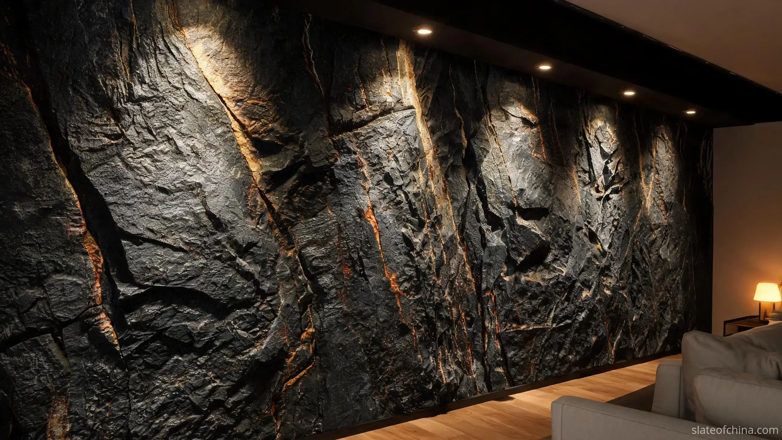
On colour temperature: warm light flatters the brown, rust and earth tones in multicolour slate; neutral light preserves the honesty of blue-grey and charcoal families. There is no universally correct answer, only the answer tested with the actual samples under the actual fixtures, beside the actual furniture, in daylight and after dark.
What lighting works best for a slate feature wall?
It follows the format and the intention. Grazing light suits stacked and heavily cleft walls when the goal is texture and drama, and it should be planned at mock-up stage so its honesty about joints and thickness lands on a wall that is ready for it. Wall washing suits large-format and calmer walls where overall colour and rhythm should lead. Whichever route is chosen, put the wall on its own circuit, and settle the colour temperature with the stone samples and the room's finishes together, in daylight and in the evening.
ACROSS THE ROOM · lighting decides whether the wall reads as a calm field or a sculpted surface.
FROM AN ARMCHAIR · lighting decides whether the texture flatters the stone or exposes every joint that wandered.
Rooms: Where Feature Walls Earn Their Place
Living rooms. A slate accent wall behind the sofa or the television anchors the seating plan and gives the room a material centre of gravity. If the wall shares attention with shelving, art or a large screen, keep the palette restrained and the relief moderate. A wall behind a television is a working wall, not a gallery wall: it wants flat formats, planned cable routes and service access decided before the stone goes up.
Fireplace surrounds. Slate gives a hearth a mineral finish that no printed alternative matches. Stacked slate wall panels for fireplace surrounds have become a quiet default for good reason: the fire supplies the grazing light itself, every evening, free of charge. One boundary stays firm – the stone itself is non-combustible, a plain fact of the rock, but suitability is decided by the complete assembly and by the appliance. Follow the fireplace manufacturer's clearance requirements, and use compatible non-combustible materials where the specification calls for them.
Bedrooms. A headboard wall in slate introduces depth without resorting to colour, and it rewards restraint: flatter faces, softer and dimmer lighting, formats that sit quietly at pillow distance. Deep stacked relief beside a bed reads as texture from the door and as busyness from the pillow. The second reading is the one that is lived with.

Restaurants, hotels and reception areas. Natural slate wall cladding for modern interiors works at two scales: the domestic feature wall and the commercial one. In commercial settings it gives a room a distinctive, hard-wearing material identity that photographs well and ages honestly – and it adds the commercial checklist: cleaning access at height, impact resistance in circulation zones, fire performance requirements, substrate capacity on tall walls, and the local building regulations that apply to fixed finishes. Design ambition here is a team sport; the stone is only the visible part of the compliance.
What to Settle Before the Stone Arrives
A feature wall is a design object that becomes a construction, and the handover happens in the specification. Five questions settle the practical half early enough to matter.
- Can the wall carry it? The structure and the substrate take the slate, the adhesive or mortar, any backings and the fixings – together, not separately. Heavy formats, tall installations and commercial applications may need engineered mechanical support. The substrate guide to slate cladding walks the common wall types and what each must prove.
- How heavy is it? Weight per square metre follows format and thickness: thin tiles and strip panels sit at the accessible end, thick large panels at the demanding end. The indicative planning numbers, and the arithmetic behind them, live in the cladding thickness and weight guide. The design-side habit is simple: never let the answer be a guess.
- How does it reach the wall? Adhesive, mortar, clips or a ventilated system – each is a route with its own substrate, weight and service conditions, and the format chooses the shortlist before the installer does. The fixing methods guide compares the routes product by product.
- Where can it move? Movement joints belong where the wall assembly, the building's behaviour and the applicable standards require them. They are not optional styling, and they are not removed by wanting a continuous look.
- What happens in wet areas? A slate feature wall in a bathroom or shower is a different project, not a feature wall with a shower nearby. Waterproofing, drainage, cleaning access and the stone's suitability for continuous damp all have to be designed, because the stone finish is not the waterproofing system.
Indoors, the maintenance question is usually gentler than people fear: dust, and routine cleaning with products suited to the stone and its finish. Whether sealing is worth it depends on the slate, the finish and the exposure, and the decision belongs with supplier guidance and a test on representative pieces – particularly where keeping the original colour and sheen matters. Deep relief, it should be said, is also a dusting decision: beautiful under grazing light, and honest about it every week.
Eight Mistakes, Read at Both Distances
Most underperforming slate feature walls are not victims of bad stone. They are victims of good stone, decided piecemeal. The eight below cover most of what goes wrong; the right-hand column is where each one should have been caught.
| The mistake | Where it shows | The better approach |
|---|---|---|
| Choosing from one small sample | Both readings, immediately | Review a representative range, arranged, under the room's own lighting |
| Ignoring colour distribution | Across the room: patches and clusters | Dry-lay and balance contrasting pieces; photograph from across the room |
| Deep relief in a narrow or busy room | From the armchair: noise and contact | Weigh flatter formats near seating and passages |
| Lighting planned after installation | Both readings, by surprise | Test stone and lighting together at mock-up stage |
| Joint widths left to the installer | From the armchair: drifting lines | Agree the joint strategy and tolerances before ordering |
| Edges and transitions left to the site | From the armchair: improvised ends | Detail edges and transitions on drawings; order them as pieces |
| Assuming every format installs alike | At handover | Confirm the fixing route for the exact product and substrate |
| Texture chosen without the room's use | Over the years | Match relief and finish to how the room is actually lived in |
The common root of all eight is the same: selection, layout, lighting and installation treated as separate decisions owned by separate people. The two-distance discipline exists to force them into one conversation, because the wall will be read as one object whether it was designed as one or not.
Before You Order: The Conversation and the Checklist
A supplier conversation for an interior slate wall should produce written answers, not reassurance. Ten items cover the ground:
- The stone type and origin, and its consistency with the approved samples.
- The colour range to expect within the order – stated, not implied.
- Nominal panel dimensions and the manufacturing tolerances.
- The thickness range, and whether the backs are calibrated.
- Face and edge finishes as actually supplied.
- The approximate installed weight per square metre for the chosen format.
- The recommended fixing method and the substrate conditions it assumes.
- Representative samples or a mock-up panel, reviewed before bulk production.
- Packaging that protects edges and corners through transport.
- The documentation available: technical information, test reports where applicable, and maintenance guidance.
Then the design side closes its own loop. Seven questions, and the wall is ready to order:
| The design question | What to verify before ordering |
|---|---|
| What does the wall look like from across the room? | Colour balance, panel rhythm and layout proportion – checked in a photograph, not in memory |
| What will people notice from the armchair? | Texture, edges, joints and transitions at close range |
| Does the format suit the room's scale? | Panel dimensions and relief against the room's size and traffic |
| Is the lighting resolved? | Daylight and evening mock-up; the wall on its own circuit |
| Are corners and transitions drawn? | Trims, returns and adjacent finishes, on drawings |
| Is the installation feasible? | Substrate, load, fixing route and movement allowance |
| Is the material approved? | Representative samples and a written specification |
For the wider decision chain – exposure, load, format, finish, fixings, quantity, price – the spec-first guide to choosing architectural slate extends this checklist into a full specification sequence. Answer the seven questions here, and that longer sequence starts already half-finished.
One Wall, Two Audiences
The best interior slate feature walls are not collections of attractive stone. They are compositions in which colour, format, joints, lighting and the surrounding room were made to agree – and the agreement was checked twice, at two distances, by design rather than by accident.
From across the room, the wall should establish its rhythm in the first glance: a colour family in balance, a layout in proportion, a texture the room can afford. From an armchair, it should reward the closer look the room will inevitably give it: cleft faces that flatter the light, edges that were drawn before they were cut, joints that run as intended, transitions that were specified rather than survived.
Whether the project calls for a dramatic stacked slate stone feature wall or a quiet run of large natural slate tiles, the discipline is the same. Choose the stone for the room. Design the layout for the wall. And judge every detail from the distance at which people will actually live with it – because that is the distance from which it will be judged, every evening, by everyone who sits down.
Frequently Asked Questions
Does a dark slate feature wall make a room feel smaller?
Not automatically. Scale, natural light and the surrounding finishes decide. Dark slate can focus a large, well-lit room and give it a centre of gravity; in a small or day-poor room it is better balanced with lighter surroundings, a larger panel format and moderate relief. Judge the combination from the doorway and from the nearest seat, under day and evening lighting, before committing.
Can a slate feature wall sit behind a TV?
Yes, with planning. Flatter formats keep the wall quiet around equipment, cable routes and service access are decided before cladding begins, and deep projection is avoided around devices that are handled often. A restrained palette also helps the wall share attention with a large screen without the two competing.
Do interior slate feature walls need sealing?
It depends on the slate, the finish and the exposure. Most interior feature walls are a dust-and-cleaning regime rather than a sealing problem. Wet areas are a different case, and any sealer decision belongs with supplier guidance and a test on representative pieces, particularly where preserving the original colour and sheen matters.
Can slate wall cladding be used around a fireplace?
Often yes. The stone itself is non-combustible as a material fact, but suitability is decided by the complete assembly and by the appliance. Follow the fireplace manufacturer's clearance requirements and use compatible non-combustible materials where the specification calls for them. The hearth surround is a designed assembly, not just a stone selection.
How heavy is an interior slate feature wall?
It depends entirely on format and thickness. Thin tiles and stacked strip panels sit at the accessible end of the range; thick, large panels sit at the demanding end. Weight planning belongs with the substrate check, and the indicative per-square-metre figures for each family are set out in the cladding thickness and weight guide.
What is the difference between a slate feature wall and a slate accent wall?
Scale and ambition. A feature wall is the room's dominant surface, dressed to lead the design; an accent is a smaller intervention that supports it. The same slate families serve both, but format, relief and joint strategy should scale with the role the wall is given rather than staying fixed.
Related Reading
Planning an interior slate feature wall?
Slate of China works with designers, builders and homeowners on natural slate interior wall projects – from stacked feature panels to large-format tile runs. Send your wall dimensions, preferred slate colour family, panel format and approximate quantity, and the reply can work through suitable material options, representative samples, available finishes and export packing – in one message, before anything is cut.
Final dimensions, fixings and structural suitability are verified by the responsible project professionals. Browse the wall cladding slate range while the enquiry is being prepared, or contact Slate of China about your feature wall.